Page: 1
/ 14
Total 317 questions
Tableau Desktop Specialist TDS-C01 Exam Practice Test
Question 1
True or False: It is possible to add a field to more than one hierarchy
Answer : A
Yes! It is possible to duplicate a field and add it to more than one hierarchy. Right click and choose duplicate.
Question 2
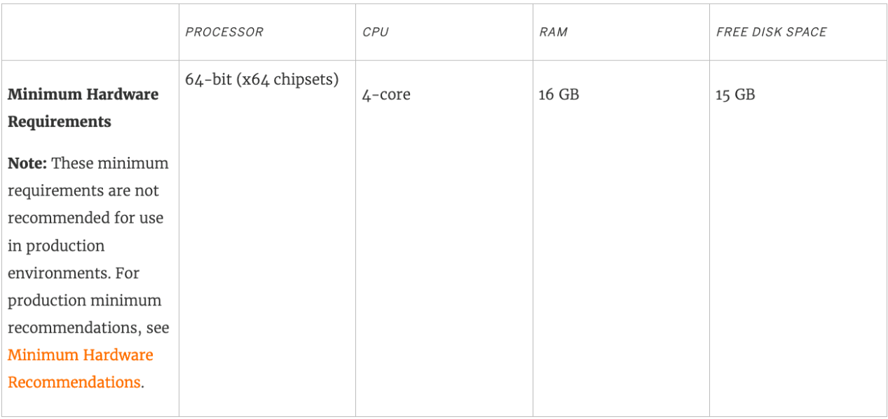
What is the minimum amount of RAM recommended for any production use of Tableau Server?
Answer : B
The computer on which you are installing or upgrading Tableau Server must meet the minimum hardware requirements. If the Setup program determines that your computer does not meet the following requirements, you will not be able to install Tableau Server.
These minimum requirements are appropriate for a computer that you use for prototyping and testing of Tableau Server. They apply to single-node installations and to each computer in a distributed installation.
Question 3
For creating variable sized bins we use __________________
Answer : A
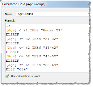
One way to view a measure in Tableau Desktop is to split it into bins. You can think of bins as buckets based on a range of values. For example, say you have a measure that represents age. Instead of aggregating the measure to calculate the average age, you can bin the measure to define age groups: 0--5, 6--10, 11--15, and so on. Then you can count the number of people in each age group.
Create a calculated field for variable bin size
Step 1
Select Analysis > Create Calculated Field.
Step 2
In the Calculated Field dialog box, complete the following steps:
Question 4
Question 30: Skipped
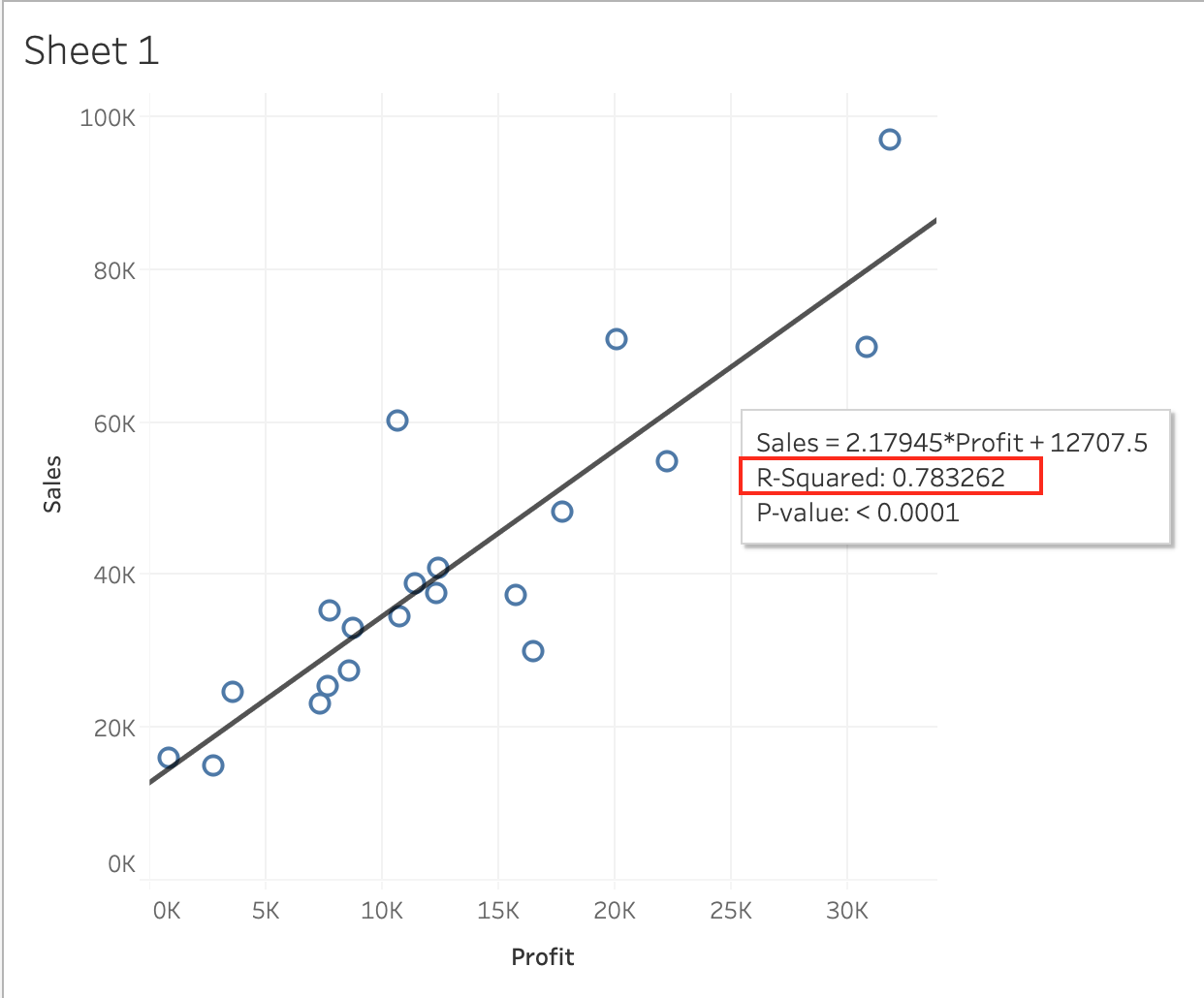
Using the CoffeeChain table, create a scatter plot of Profit (x-axis) vs Sales (y-axis) broken down by State. Add a Linear trend line to the view. What is its R-squared value?
Answer : A
Trend lines have become popular questions in recent Tableau examinations. Follow along:
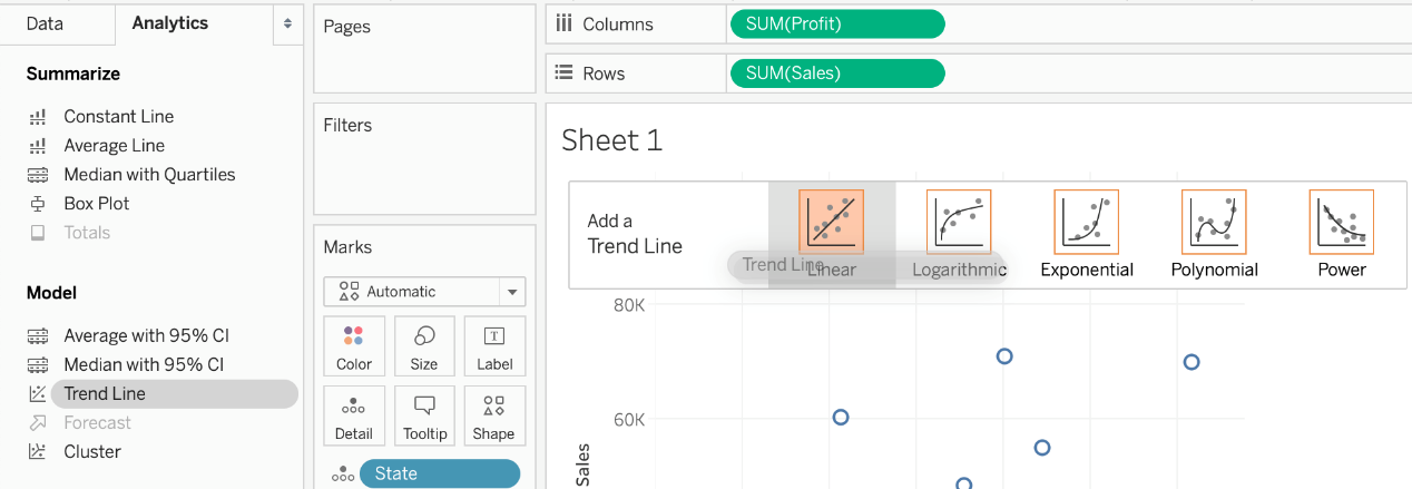
1) First drag Sales to the Rows shelf and Profit to the Columns shelf:
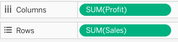
You will only see a single mark since the view is aggregated.
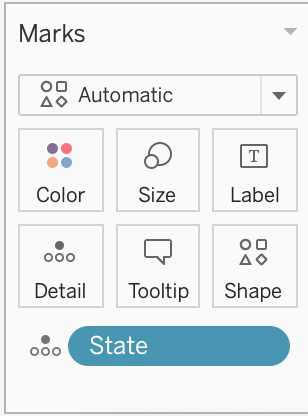
2) Now, break down this view by state. Drag State into Detail on the Marks shelf ( or directly to the view):
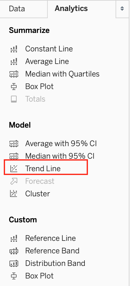
3) Finally, move to the Analytics pane, and drag Trend line to the view. When you drag it, select the Linear option!:
4) The following is our view. Hover over the trend line to see the R-squared value:
Question 5
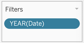
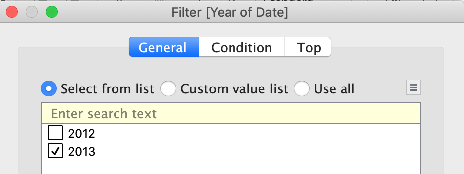
Using the CoffeeChain table, create a Dual Axis chart showing the Sales (Bar chart) and Profit (Line Chart) for each Product type. What was the Profit for the Herbal Tea product type in 2013?
Answer : C
If you answered this question quickly and correctly, you're well prepared for the exam! Most students stumble while creating a Dual axis chart, so go ahead and give yourself a pat on the back!
To create a dual axis chart for the problem mentioned:
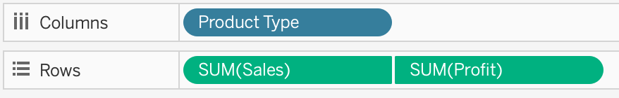
1) Drag Product Type to the column shelf, and Sales and Profit to the Row shelf:
2) Now, to focus on 2013, drag Date to the filter shelf and select only 2013:
3) Now, click on the Profit pill in the Rows Shelf, and select dual axis:
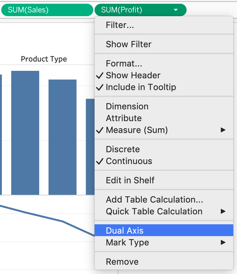
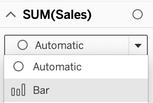
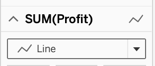
4) Now, in the marks shelf, choose Sales, and change the chart type to bar. Similarly, for Profit, change the chart type to Line.
Now the chart looks like this:
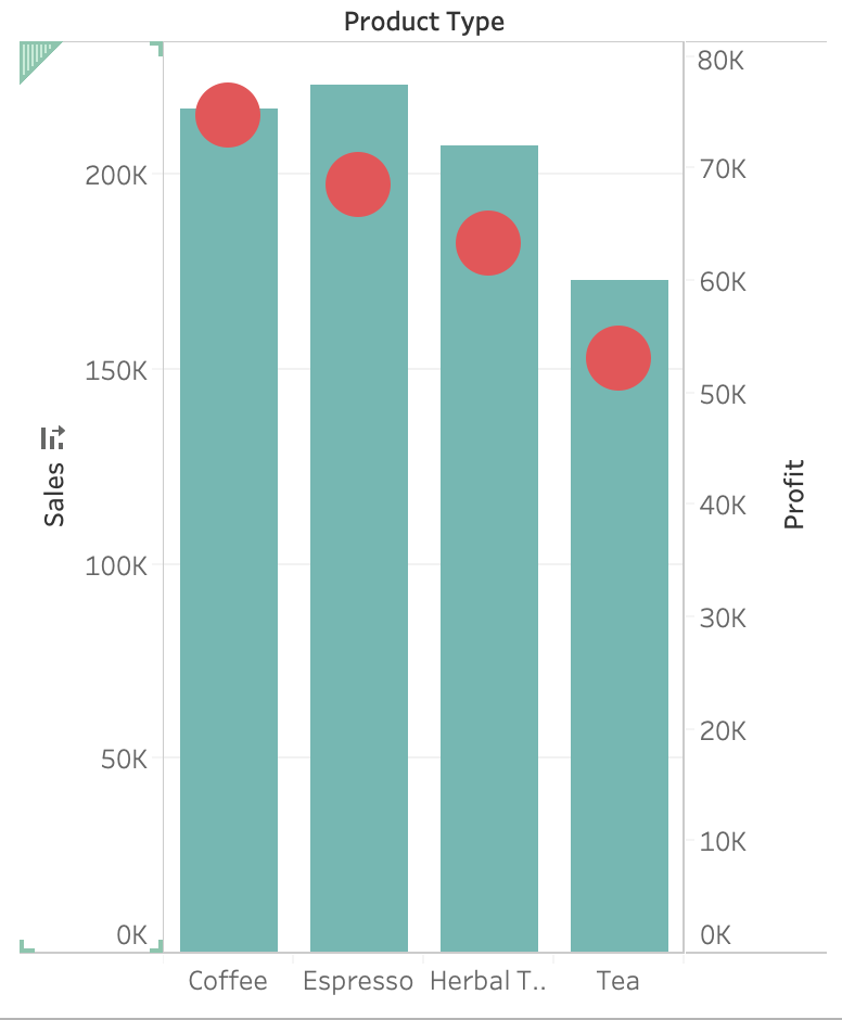
Now we change the Profit chart type to line:
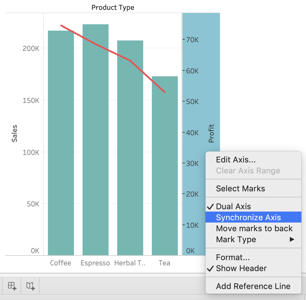
5) Finally, we synchronise the axis as follows: Right click on the axis, and choose 'Synchronise axis'
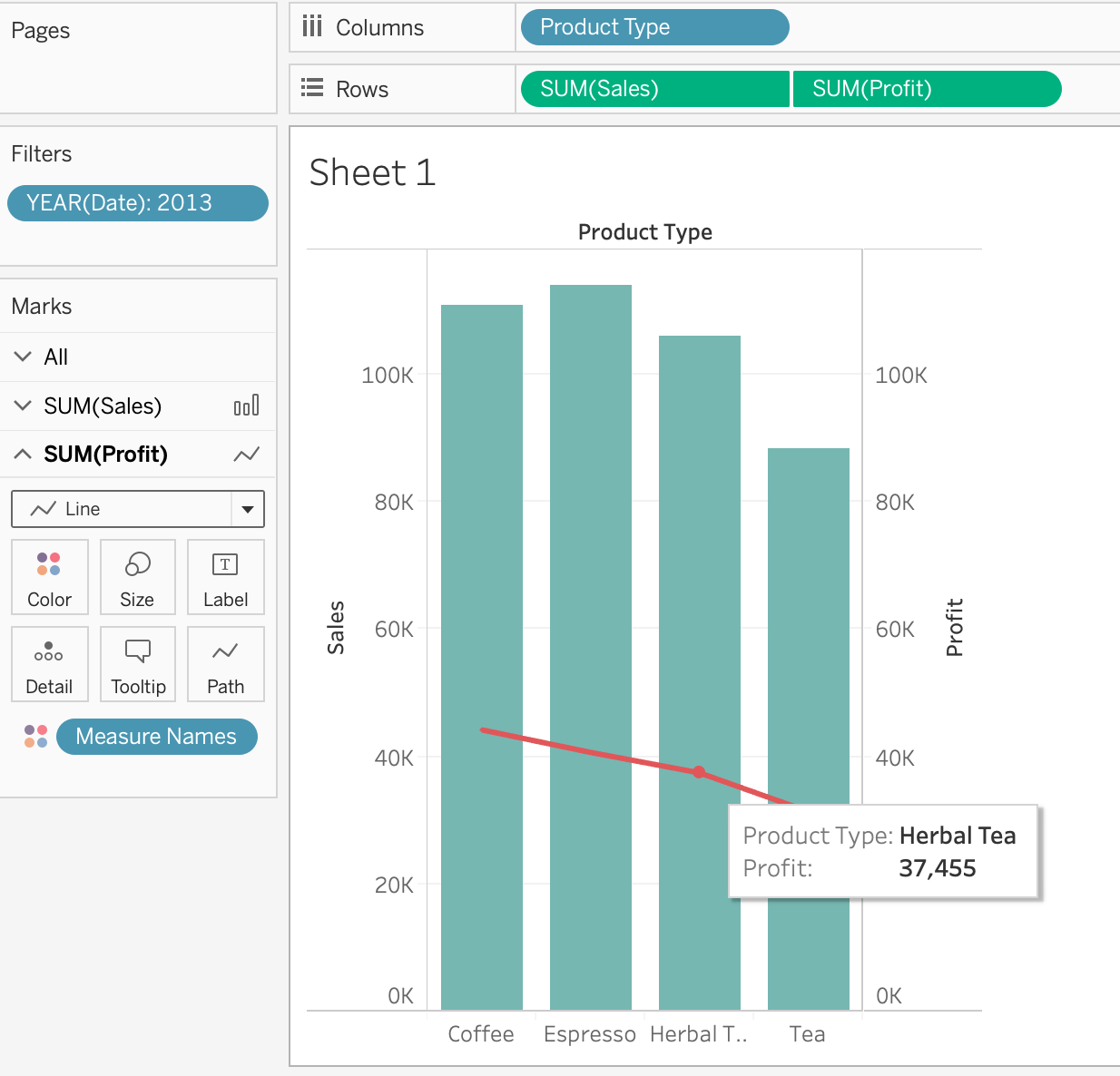
And, our final view and answer is:
Question 6
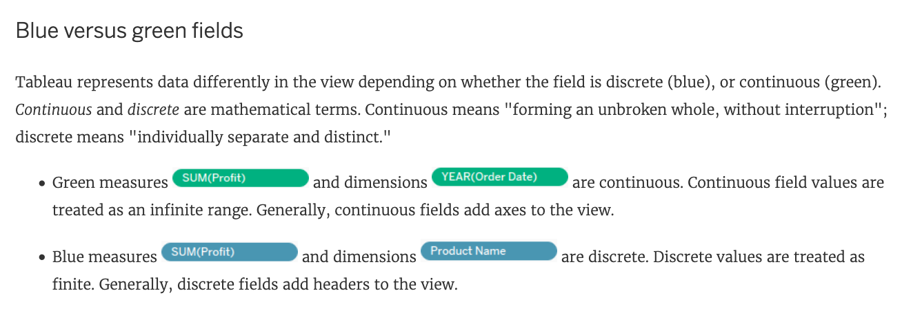
How do you identify a continuous field in Tableau?
Answer : B
When you connect to a new data source, Tableau assigns each field in the data source as dimension or measure in the Data pane, depending on the type of data the field contains. You use these fields to build views of your data.
Question 7
Skipped Join the Geo Data and Time Series Table on the Item Number ID column, and display the Store count for every State on a Map. What was the Store count in 2017 for Texas (TX)?
Join the Geo Data and Time Series Table on the Item Number ID column, and display the Store count for every State on a Map. What was the Store count in 2017 for Texas (TX)?
Answer : C
Since you need BOTH State and the YEAR, we need to use an Inner Join.
Follow the steps below: